Dulux White on White: A Designer’s Guide for Modern Australian Homes
Choosing the right white paint can be harder than it seems. Dulux White on White has become a go‑to choice for homeowners across Australia because it feels fresh and modern without looking clinical. It reads as a pure white until it is placed next to a true white like Vivid White, where a soft blue undertone reveals itself.
This undertone and high light‑reflectance value (LRV) make it perfect for open‑plan living, coastal interiors and contemporary homes. This guide explains how to use this colour effectively and how to avoid common pitfalls. By the end of this guide, you’ll know whether Dulux White on White™ suits your home, how it behaves in different light, what to pair it with, and when you’re better off choosing another white.
Key Takeaways
- Soft blue undertone – Dulux White on White™ is a crisp cool white with a soft blue undertone and a high LRV (87). It brightens rooms without the starkness of icy whites.
- Versatile and cohesive – This colour works in sun‑filled interiors and on exteriors, especially when paired with grey tiles, marble, blue‑based flooring and dark timbers.
- Compare and test – Always test A4 swatches and sample pots against other whites like Vivid White and Lexicon Quarter to see undertone differences.
- Pair thoughtfully – For trims choose Lexicon Quarter for a cool match or Vivid White for crisp contrast; avoid warm beige tiles and yellow-toned timbers.
What Makes Dulux White on White™ Different? (Undertone, LRV & Style)
The Dulux colour description positions White on White as a clean, minimalist white with a slightly cool undertone. A small amount of tint gives it depth and helps disguise minor surface imperfections better than a completely untinted white.
With an LRV in the high 80s (around 87), White on White reflects a lot of light, which can make compact rooms feel bigger, soften transitions between spaces in open-plan layouts and keep homes feeling airy all year round. This crisp quality is why designers favour it in modern, Hamptons and coastal homes.
Because the undertone leans cool rather than creamy, White on White tends to feel current and architectural – a strong match for modern Australian homes with grey roofs, crisp lines and cooler palettes.
Also Read: How to Choose a Color Palette for Your Home's Interior Design
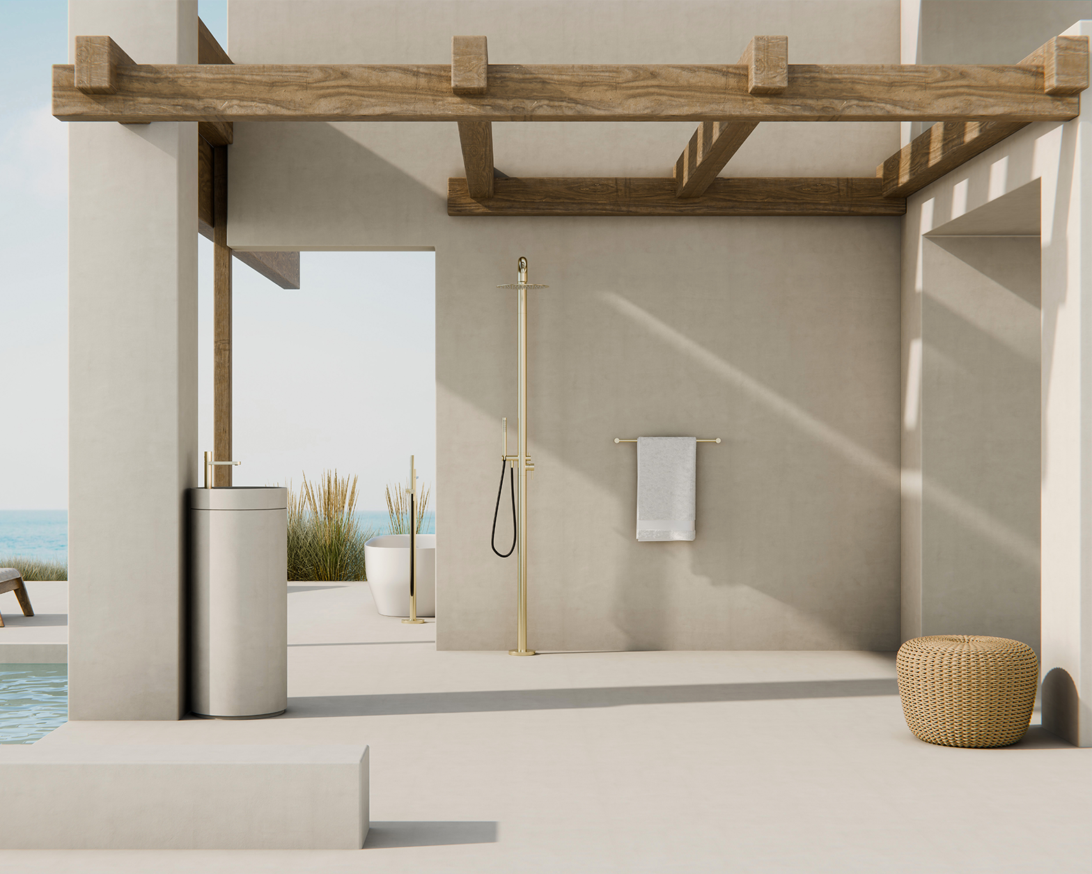
Where Does Dulux White on White Work Best?
Source: Dulux Australia
1. Light-Filled Interiors (North & East-Facing Rooms)
White on White really comes into its own in north- and east-facing rooms with plenty of natural light. In these spaces, it reads clear and bright without the slightly icy quality that some stronger blue whites can have.
Bright rooms and cool palettes
- Interior designers recommend using White on White in spaces flooded with daylight.
- It pairs beautifully with grey or blue‑based flooring and stone benchtops with cool veining.
- Carpets in the grey‑blue trend and dark walnut or chocolate flooring also work because the cool white calms red undertones.
- Avoid warm stone, beige tiles or yellow-toned timbers, as they make the white look dingy.
Also Read: [GUIDE] Modern Mediterranean Interior Design for Australian Homes
Tricky Orientations and Low-Light Rooms
- In south-facing rooms or spaces with little natural light, cool whites can appear bluer. White on White is still usable, but you need to test it carefully alongside a slightly warmer option, such as Dulux Natural White, and check it under your exact artificial lighting – especially cool 4000–5000K LEDs.
- If a room feels too cold, you can soften the effect by introducing warm textures like rattan, linen, tan leather and metallic finishes like brushed brass tapware.
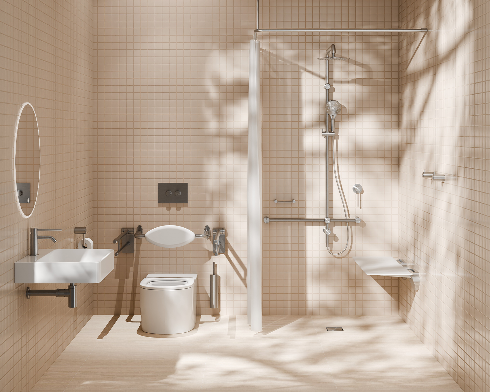
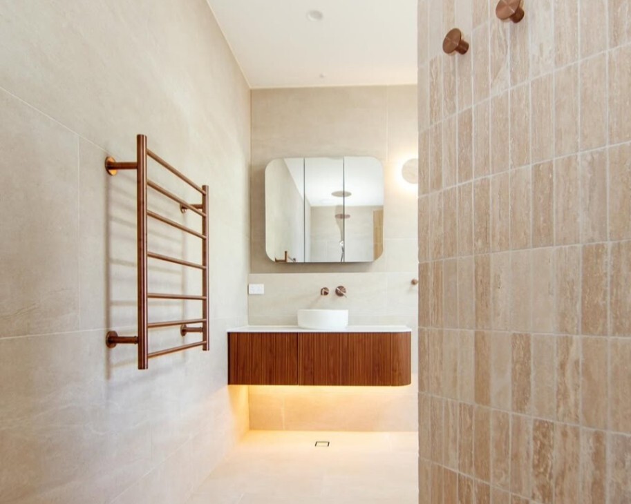
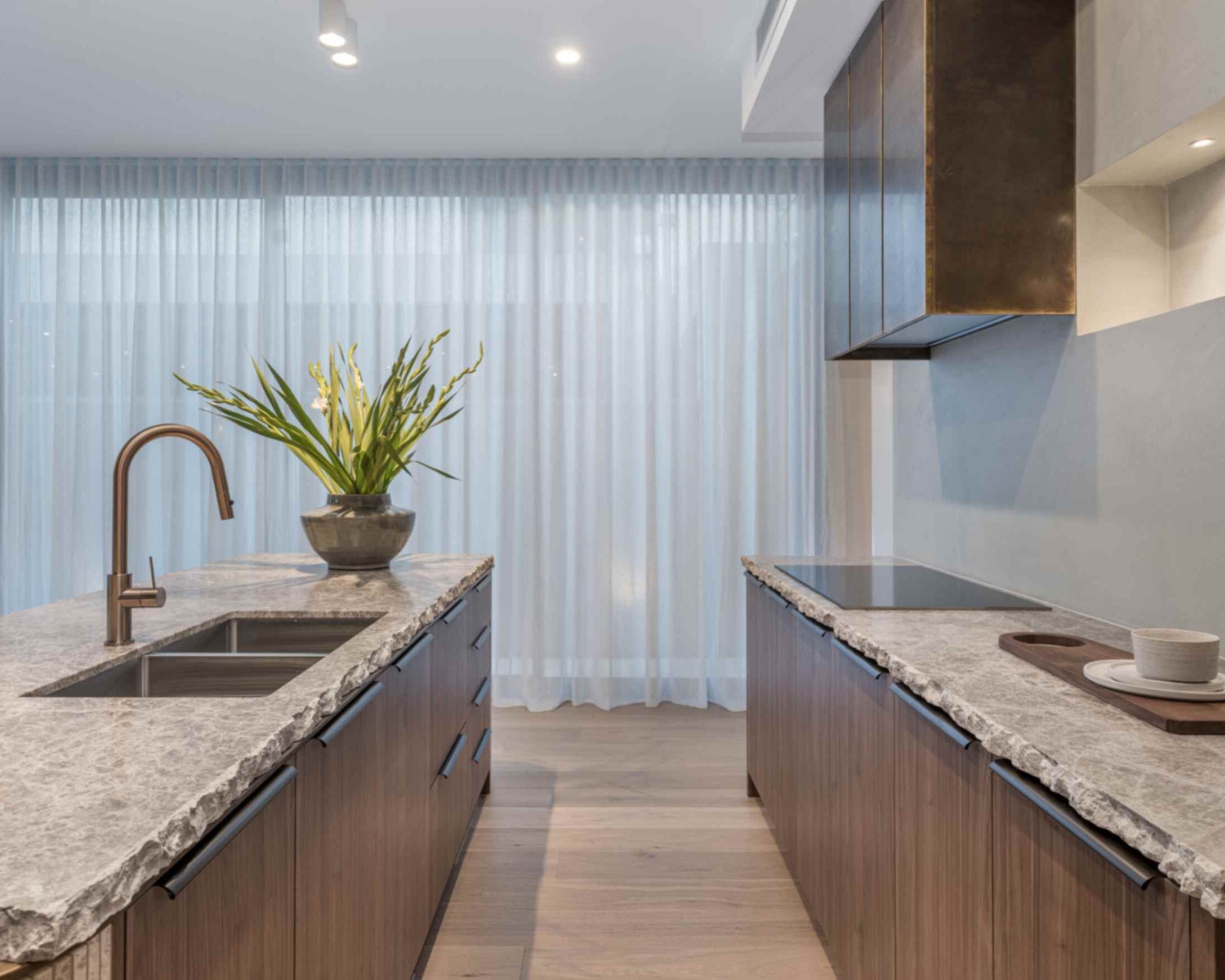
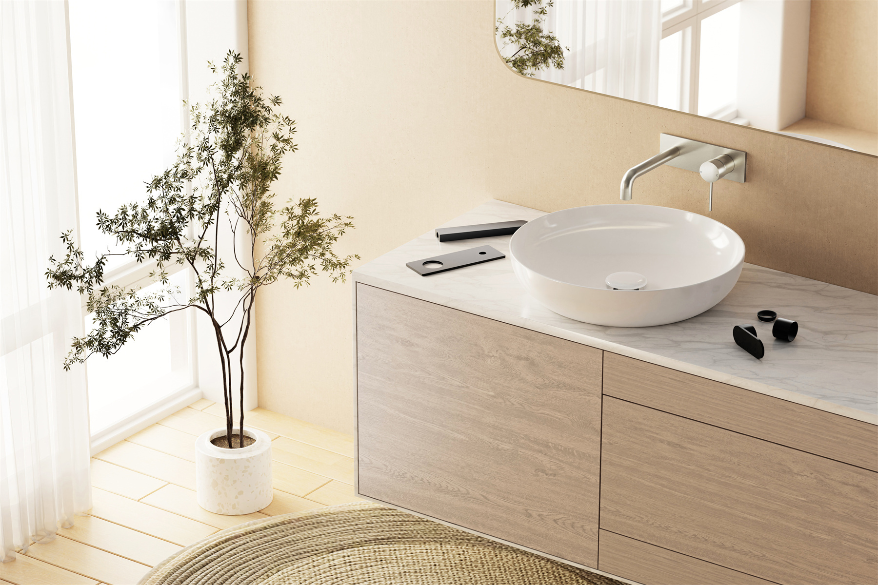
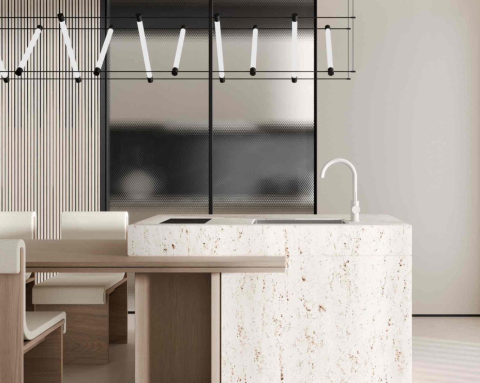
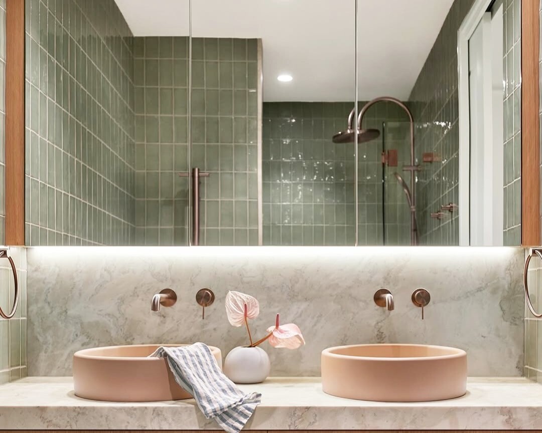
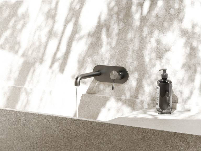
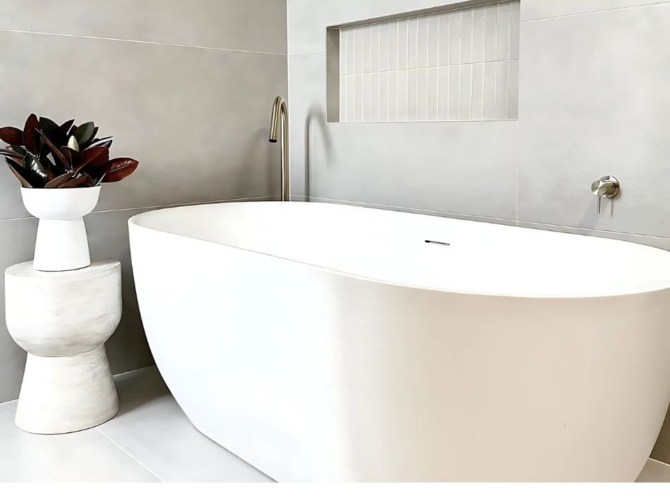
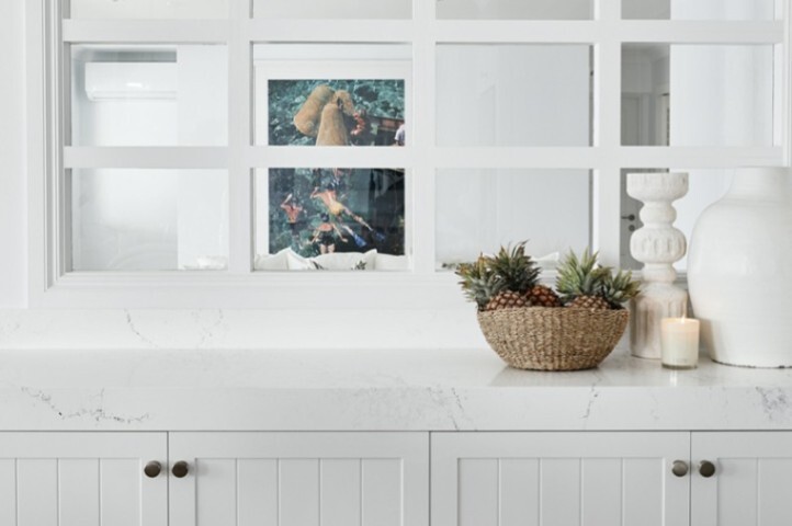
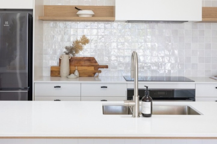
Kitchens, bathrooms and laundry rooms
- White on White provides a crisp backdrop for modern fixtures and tiles.
- It works especially well with marble-look stone, concrete-look tiles and white or grey subway tiles, and it makes stainless steel appliances and brushed nickel hardware feel deliberate rather than busy.
- It also highlights coloured cabinetry in navy, charcoal, eucalyptus or duck-egg blue – especially when you echo those tones in your Nero tapware and accessories.
Nero Design Tip: For hardware, pair White on White with brushed nickel or gun metal tapware for cool, understated schemes, or choose brushed gold or brushed bronze from Nero’s Mecca, Serenity or Zen collections when you want warmth and a subtle focal point against cool stone and tiles.”
Also Read:
- 35 Green Bathroom Ideas & Designs For All Styles: Complete Guide
- 50+ Purple Bathroom Ideas for Australian Homes: Elegant, Bold & On-Trend Designs
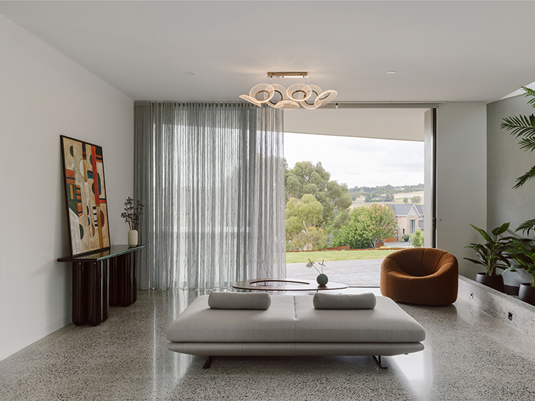
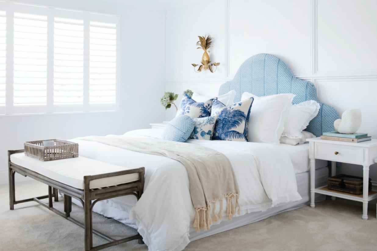
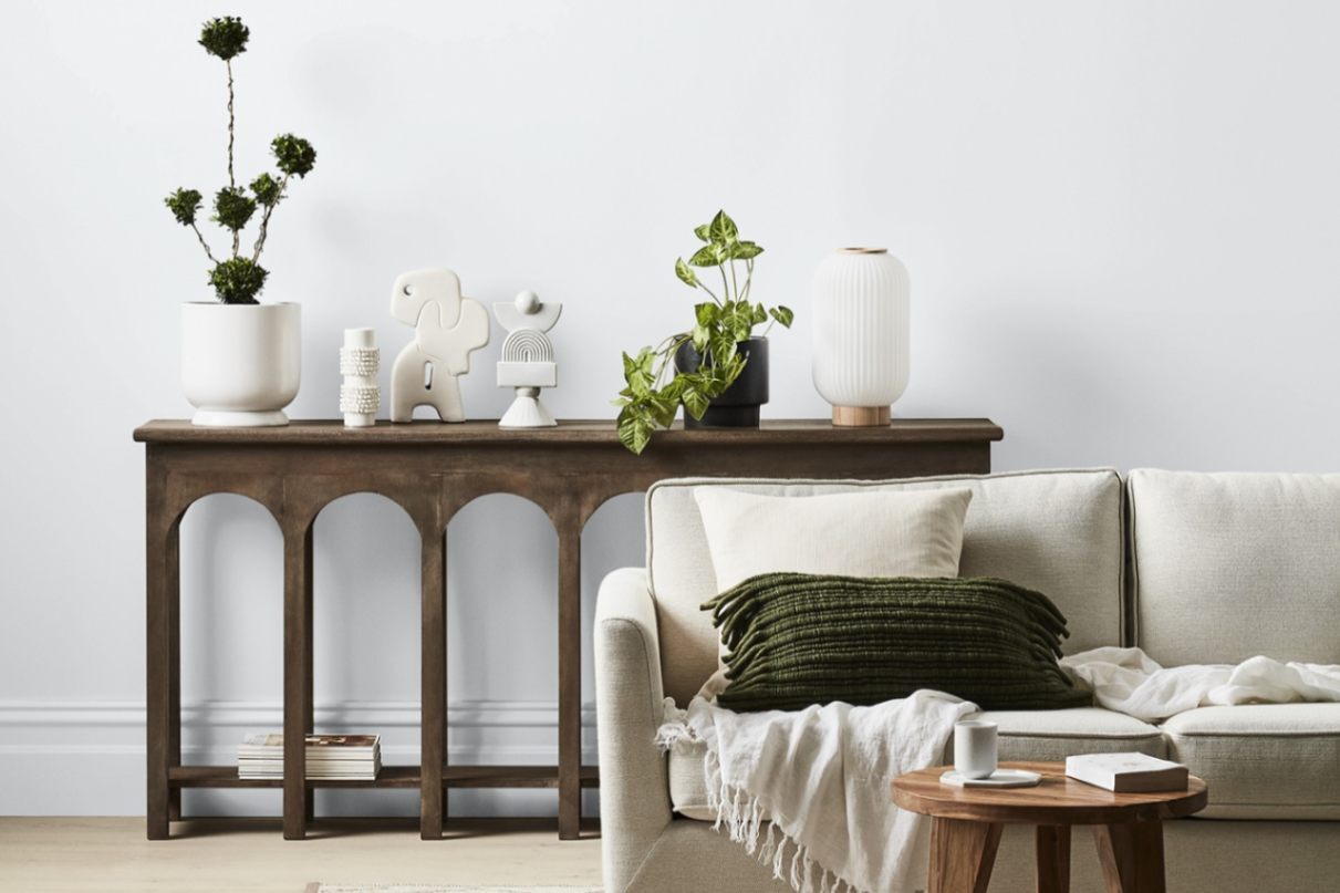
Living Spaces and Bedrooms
In bedrooms and living rooms, using White on White on both walls and ceilings creates a calm shell that’s easy to layer onto.
Nero Design Tips:
- Add soft greys, navy, charcoal and muted blues in textiles and rugs, then bring in one or two warm elements – a timber coffee table, a woven pendant or a caramel leather armchair – to keep the space from feeling too cool.
- Use Dulux Lexicon Quarter for tonal trims or Dulux Vivid White for contrast. Layer navy and mid‑grey furnishings and add natural textures like linen and rattan for warmth.
Also Read:
- Coffered Ceilings: Modern Designs, Benefits, Costs & DIY Guide
- Raked Ceilings: Benefits, Design Ideas & Practical Considerations
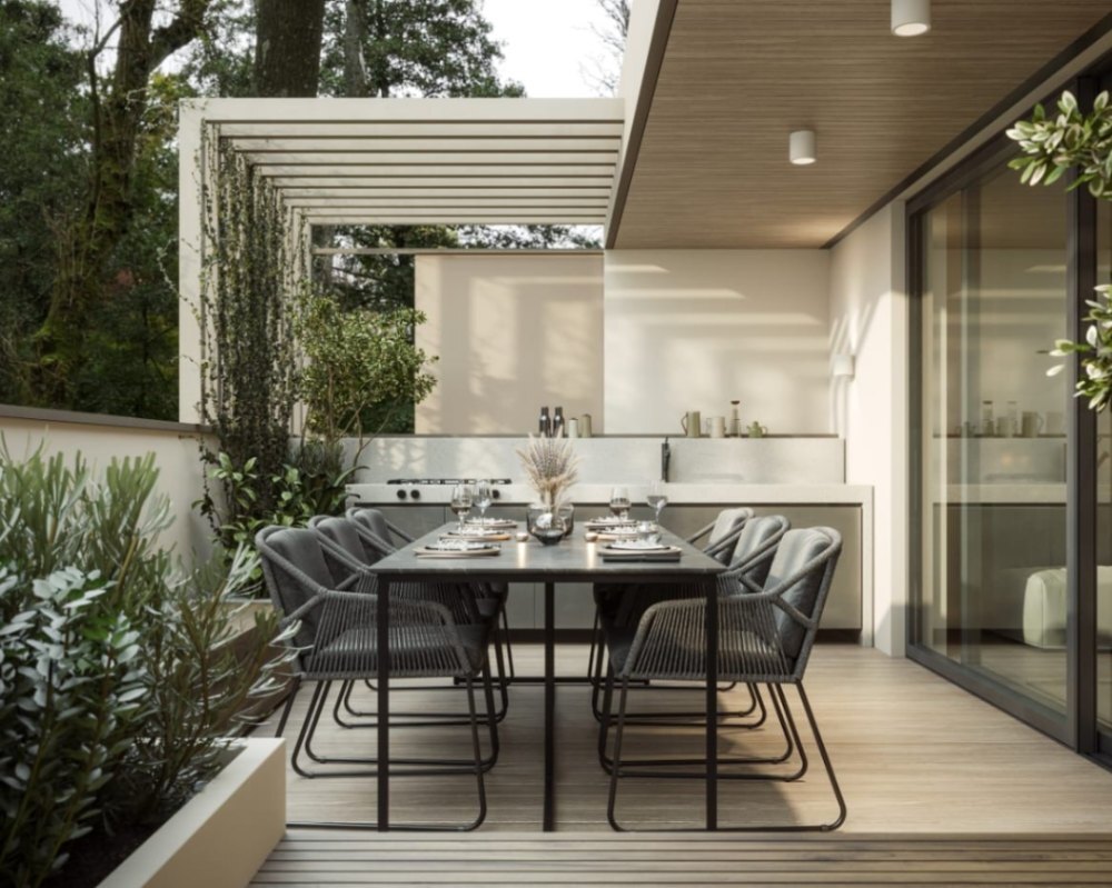
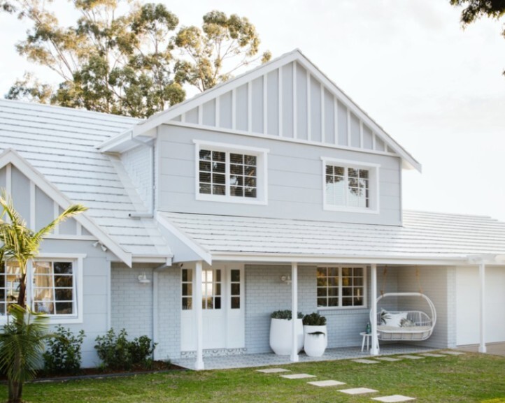
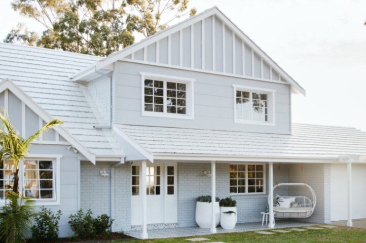
2. Home Exteriors and Facades
White on White isn’t limited to interiors. Its high LRV means it looks even brighter under Australian sunlight. In fact, Dulux White on White looks bright and clean rather than cream or yellow under strong Australian sun.
- Use it on weatherboards, rendered facades and trim for Hamptons-style homes.
- To ground the brightness, pair it with roof and gutters in Monument, Surfmist® or Shale Grey™ (or similar neutrals), and choose window frames in black, deep charcoal or crisp white.
- Outdoor tapware and hardware in aged brass, brushed gold, or black add gentle contrast without fighting the white.
Pairing and Comparing Dulux White on White with Dulux’s Other White Variations
Source: Dulux Australia
Dulux White on White vs Vivid White
Vivid White is Dulux’s purest white. Professional painters note that it contains no tint and can require extra coats. It has warm undertones, which can feel softer.
White on White contains a small amount of pigment, giving it a cool blue hue that hides minor flaws and feels modern. When you place the two side by side, White on White will appear slightly blue.
Verdict: Vivid White is Dulux’s purest white – essentially untinted base – which can look brilliantly clean but also unforgiving, while White on White has a hint of cool blue that hides imperfections and feels more architectural.
When to choose which: Use Vivid White on ceilings and trims when you want a super-crisp edge or gallery-style spaces, and choose White on White for walls where you want brightness plus a touch of softness, especially in open-plan homes.
Read more about Dulux White on White vs Vivid White here.
Dulux White on White vs Lexicon Quarter and Natural White
Lexicon Quarter has a stronger blue undertone than White on White and can look icy in low light. It is often used on trims while White on White appears on walls, but the combination can also be reversed.
🔹Helpful Design Tip: If you love very cool, almost gallery-like spaces, you can reverse the usual combination and use Lexicon Quarter on walls with White on White on trims – just be careful in shaded or south-facing rooms, where Lexicon Quarter can read quite icy.
Natural White sits at the opposite end of the spectrum with warm creamy undertones. It suits heritage homes and warm finishes, whereas White on White pairs better with grey stone, stainless steel and cool textiles. Always test all options under your lighting to decide which undertone works best.
🔹Helpful Design Tip: If your fixed elements lean warm – beige floor tiles, honey timber or warm white LED lighting – White on White can look out of place or overly blue. In those cases, Natural White or another warm white may be a better fit, while you keep White on White in cooler, light-filled spaces.
How to Pair White on White with Fixed Elements, Colour Schemes & Nero Tapware
Source: Dulux Australia
Before locking in any paint colour, start with what can’t easily be changed: floorboards or tiles, benchtops and splashbacks, kitchen and bathroom cabinetry, window frames and major furniture pieces.
- White on White suits materials with cool grey or blue undertones and pairs well with dark timbers. Think grey and blue-based tiles and stones, cool concrete or terrazzo, dark walnut, blackbutt or smoked oak floors, and carpets in grey, charcoal or blue-grey.
- Avoid beige tiles, cream cabinetry or yellow‑toned woods.
- For a cohesive scheme, layer soft grey and navy in rugs, curtains and cushions and repeat each colour at least twice.
- A touch of brushed bronze or gun metal hardware introduces warmth without clashing.
🔹Nero Design Tip: When you’re building a palette, choose your fixed elements first and confirm that White on White works with them in both daylight and artificial light. Then layer soft greys, navy, dusty blues and textural neutrals (linen, sisal, rattan) and introduce metal finishes – brushed nickel, brushed gold or gun metal – through Nero tapware, door hardware and lighting to tie the scheme together.
Step-by-Step Guide: How to Test Dulux White on White in Your Home
Digital screens distort colour. To avoid surprises, follow the steps below to test and sample Dulux White on White first.
- Order A4 swatches or sample pots. Include Dulux White on White™, Vivid White, Lexicon® Quarter and at least one warmer option such as Natural White.
- Paint large boards, not tiny chips. Use pieces of cardboard or sample boards and paint two coats of each white.
- Move them around your home. Place boards next to your floors, benchtops and tiles, and on different walls in the same room.
- Check at different times of day. Look at the boards mid-morning, afternoon and evening, under both natural light and your existing or planned light fittings (especially cool 4000–5000K LEDs).
- Compare side-by-side. Seeing colours directly against each other is the quickest way to spot undertones and decide whether White on White feels crisp, too cool or just right in your space.
- Get expert help if you’re unsure. A one-hour consult with an interior designer or Dulux colour consultant is often cheaper than repainting a whole house.
Pro Tips & Common Mistakes for Interior Design with Dulux White on White
Source: Dulux Australia
- Create flow: Paint walls, ceilings and interior doors in the same colour to make open‑plan spaces feel unified. White on White is ideal for this because it bridges rooms without drawing attention to itself.
- Add texture and contrast: An all‑white room can feel flat. Introduce texture with timber furniture, rattan pendant lights, linen upholstery and natural stone. Use matte black or brushed bronze hardware from Nero’s collections for subtle contrast.
- Check your lighting: Cool whites behave differently under various light sources; assess natural and artificial light before you decide.
- Avoid yellow undertones: Warm stone, beige tiles or honey‑toned timber will highlight the blue undertone and make the white look out of place.
Do:
- Use Dulux White on White™ throughout open-plan spaces to create a sense of flow between living, dining and kitchen areas.
- Pair it with cool materials and grey-based neutrals so the undertone feels deliberate.
- Choose tapware finishes that either echo the coolness (brushed nickel, chrome, gun metal) or deliberately warm it up (brushed brass, brushed gold).
Avoid:
- Partnering it with strong yellow or orange undertones in tiles and flooring, which exaggerate the blue cast.
- Relying only on very cool downlights; they can push White on White towards icy.
- Skipping sample boards because ‘it’s just white’ – this is where undertones matter most.
Also Read: [GUIDE] Dopamine Decor & Interior Design Tips to Boost Your Mood - Nero Tapware
Frequently Asked Questions
Does Dulux White on White look blue?
White on White has a soft blue undertone. In bright natural light it reads crisp white; in shadow or under cool LEDs it can appear slightly bluer. Testing swatches in your own lighting will reveal how it behaves.
Is Dulux White on White suitable for exteriors?
Yes. The high LRV makes it luminous on exteriors, and the soft blue undertone looks crisp under sunlight. Pair it with neutral guttering and avoid warm brick or beige stone.
How should I choose trim colours with White on White?
For a subtle match, choose Lexicon Quarter which shares a cool undertone. For a crisp contrast, use Vivid White. Always test combinations to ensure they complement your fixed elements.
Can I use White on White on kitchen cabinets?
Yes. White on White dulux paint works well on cabinets when paired with cool stone benchtops and splashbacks. Consider accenting cabinets with Nero’s brushed nickel or matte black handles and mixers for a cohesive look.
Finishing the Look: Pairing Dulux White on White with Nero Tapware
Dulux White on White provides a modern backdrop that balances brightness and subtlety. Its cool undertone and high LRV create fresh interiors and crisp exteriors – as long as you test it in your own light, pair it with cool-leaning materials and avoid strong yellow or orange tones.
To finish the look, choose tapware that complements your palette and home style:
- Cool, minimal schemes – Nero Zen or Serenity in brushed nickel or chrome work beautifully with marble-look benchtops and grey tiles.
- Coastal and Hamptons homes – Nero Mecca or Opal in brushed gold or brushed bronze add warmth and a soft focal point against White on White walls and pale timbers.
- Urban and industrial spaces – Nero Bianca or Dolce in gun metal or matte black echo concrete, steel and darker stone.
Combine a carefully tested white like Dulux White on White with quality fixtures from Nero Tapware and your home will reflect your personal style! We offer different bathroom and kitchen tapware collections to suit every design style including our popular Mecca, Serenity, Zen, Opal, and Bianca.